Theme
License: LGPL-3.0 (GNU Lesser General Public License v3.0)
This resource is based on ox_lib which is licensed under LGPL-3.0.
⚠️ This redesign is a paid product. Only verified purchasers are eligible for support and updates. Unverified users will not receive any assistance under any circumstances.
Overview
The theme system provides 4 visual presets that affect all UI components globally. Each theme defines 60+ CSS custom properties controlling colors, backgrounds, borders, gradients, and effects.
# config.cfg
set ox:theme 0
Theme Presets
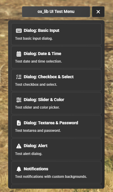
Theme 0 — Dark Professional
- Solid dark backgrounds (
#1a1a2e,#16213e) - High-contrast text on dark surfaces
- Blue accent color with gradient highlights
- Clean, professional appearance
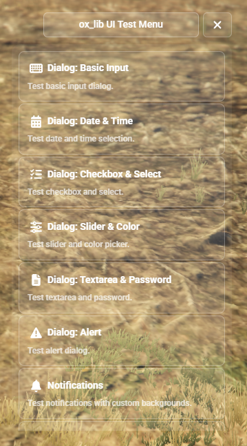
Theme 1 — Liquid Glass
- Transparent, frosted glass aesthetic
- Game background visible through UI panels
- White/light color scheme with subtle opacity
- Soft shadows and glass reflections
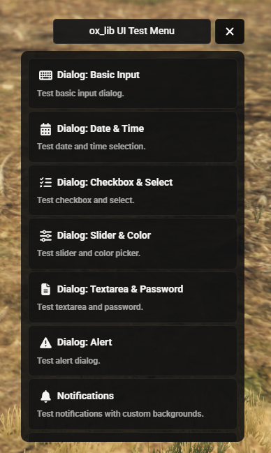
Theme 2 — Glassmorphism + Minimal Dark
- Higher opacity glass panels compared to Theme 1
- Cyan-blue accent tones
- Minimal dark UI elements with glass overlays
- Modern glassmorphism design language
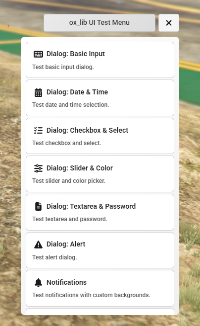
Theme 3 — Light
- White and bright backgrounds
- Dark text for maximum readability
- Light borders and subtle shadows
- Inherits some accent colors from Theme 0
CSS Variable Categories
All CSS variables are prefixed with --ox- and applied to the document root.
Backgrounds
| Variable | Description |
|---|---|
--ox-bg |
Main panel background |
--ox-bg-gradient |
Gradient background for panels |
--ox-header-bg |
Header/toolbar background |
--ox-input-bg |
Input field background |
--ox-input-bg-focus |
Input field background on focus |
--ox-hover-bg |
Hover state background |
--ox-dropdown-bg |
Dropdown menu background |
--ox-overlay |
Full-screen overlay |
Text
| Variable | Description |
|---|---|
--ox-text |
Primary text color |
--ox-text-dim |
Dimmed text |
--ox-text-secondary |
Secondary text |
--ox-text-muted |
Muted/placeholder |
--ox-text-desc |
Description text |
--ox-text-disabled |
Disabled state text |
Borders
| Variable | Description |
|---|---|
--ox-border |
Default border |
--ox-border-light |
Light/subtle border |
--ox-border-header |
Header border |
--ox-border-focus |
Focus state border |
--ox-border-input |
Input field border |
Accent / Gradient
| Variable | Description |
|---|---|
--ox-accent |
Primary accent color |
--ox-accent-dark |
Dark accent variant |
--ox-accent-bright |
Bright accent variant |
--ox-accent-gradient |
Accent gradient |
--ox-accent-hover |
Accent hover state |
--ox-accent-glow |
Glow effect color |
--ox-accent-glow-strong |
Strong glow effect |
Components
| Variable | Description |
|---|---|
--ox-slider-track |
Slider track background |
--ox-slider-bar |
Slider filled bar |
--ox-slider-thumb |
Slider thumb |
--ox-control-bg |
Control button background |
--ox-control-hover |
Control hover state |
--ox-control-active |
Control active state |
--ox-check-bg |
Checkbox background |
--ox-check-checked |
Checkbox checked state |
--ox-check-border |
Checkbox border |
--ox-btn-neutral |
Neutral button background |
--ox-btn-neutral-border |
Neutral button border |
--ox-btn-neutral-hover |
Neutral button hover |
--ox-danger |
Danger/error color |
Radial Menu
| Variable | Description |
|---|---|
--ox-radial-bg |
Radial menu background |
--ox-radial-sector |
Sector fill |
--ox-radial-sector-border |
Sector border |
--ox-radial-sector-hover |
Sector hover fill |
--ox-radial-sector-hover-border |
Sector hover border |
--ox-radial-center |
Center button |
--ox-radial-center-hover |
Center button hover |
--ox-radial-center-stroke |
Center button stroke |
SkillCheck
| Variable | Description |
|---|---|
--ox-sc-bar-bg |
Bar background |
--ox-sc-bar-border |
Bar border |
--ox-sc-bar-inner |
Bar inner fill |
--ox-sc-hitzone |
Hit zone indicator |
--ox-sc-indicator |
Moving indicator |
Miscellaneous
| Variable | Description |
|---|---|
--ox-font |
Font family |
--ox-radius |
Default border radius |
--ox-radius-sm |
Small border radius |
--ox-radius-xs |
Extra small border radius |
Last updated: 2026-02-18